 |
Analyzing Your Data |
Oracle Discoverer Tutorial
|
Tip: Print this page.
The total estimated time you need to complete lesson 3 is 45 minutes.
Overview of Lesson 3
In lesson 2 you created your own workbook. In this lesson, we return to the tutorial
Workbook Video Stores Analysis to do some ad hoc analysis. Discoverer provides
several powerful analysis tools, such as:
- Sorting rows and columns.
- Pivoting rows and columns.
- Drilling into data to see more detail.
- Adding totals to your Worksheets.
- Calculating percentages on numerical data.
- Creating your own calculations on data.
- Graphing your data.
In lesson 3 you will use these data analysis tools to help you arrive at a business decision.
For example, are sales higher in particular regions? What other factors contribute to higher sales? By using Discoverer's
analysis tools, you will find the answers to these and your own particular business questions.
Sorting rows and columns
Data in a Worksheet is arranged in rows and columns similar to a spreadsheet. Also similar
to a spreadsheet, you can sort both rows and columns alphabetically and numerically, from high-to-low or low-to-high.
However, Discoverer's sorting capabilities are more powerful than what you may be used to from using spreadsheets.
In addition to simple column and row sorting, you can also sort within other sorts, or group
sort. For example, you may wish to sort on City name within Region.
In the previous lessons, you learned how to open the Video Stores Analysis Workbook, and
how to create your own Workbook. In this lesson, we return to the Video Stores Analysis Workbook to perform some analysis tasks on the data.
- Connect to the Video Store Tutorial database and open the Video Stores Analysis Workbook. Hint.
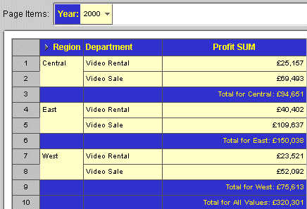
- At the bottom of the Worksheet, click the tab labeled Tabular Layout. After the query finishes, notice that the Worksheet is already sorted alphabetically
by Region.
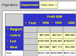
- From the Page Items area, choose 2000 from the list of Years.
- Instead of sorting by Region, you want to sort by Profit SUM, so that you can see Profit
SUM figures in descending order, (highest first). From the menu, choose Tools | Sort. The Worksheet Wizard appears, open
to the Sort tab.
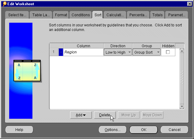
- Click the box next to the Region Item and click Delete to remove the Region sort.
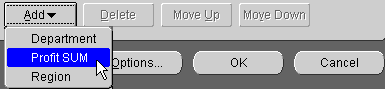
- Click the Add drop-down list
and select Profit SUM. The Add drop-down list shows
all the Items that you have in your Worksheet.
Choosing an Item from the Add drop-down list causes
Discoverer to sort using that Item.
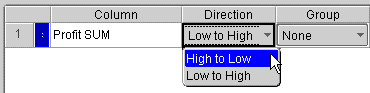
- Click the Low to High pull
down list next to Profit SUM, (under Direction). From
the drop-down list, choose High to Low.
- Under the column heading Group, do not change the setting None.
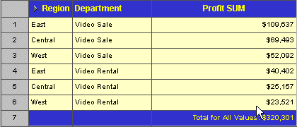
- Click OK to view the change
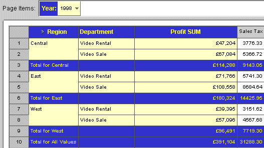
to your Worksheet. The data is now sorted by Profit SUM, with the highest value at the top ($109,637) for the Video
Sale Department in the East Region.
Find out more about what you can do with Discoverer's sorting features by experimenting
with different sorts on different Items. When you have finished, if you want to return to the original Video Stores
Analysis Workbook, close the current Workbook without saving it.
Pivoting rows and columns
In Lesson 2, you created a Page Item to group data by Region. You also created axis Items to group data by Region and Department. At any time, you can change Page Items and axis Items so
that your data is grouped in a way that is more meaningful for you. Changing the positions of Page Items and axis
Items is called pivoting.
Perhaps you want to compare sales by Department for each Region. You still want to see information
about the Regions, but you would rather see all Departments on the same page with a separate page for each Region.
By pivoting the position of your Page Items and axis Items, you can create comparisons that better suit your needs.
- Connect to the Video Store Tutorial database and open the Video Stores Analysis Workbook. Hint.
- From the menu, choose Sheet | Edit Sheet. By now you have figured out that you do most of your work with the Edit
Sheet dialog. As you would expect, you also use the Edit
Sheet dialog to pivot Items.
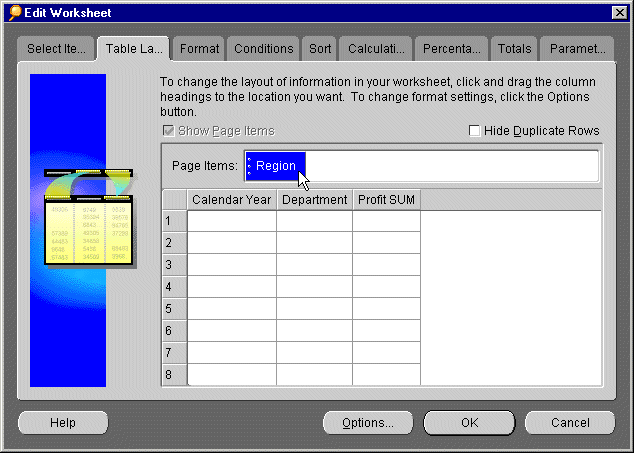
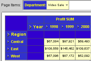
- Click the Table Layout tab.
Currently, you have only one Page Item: which
is Calendar Year. Drag the Calendar Year Item down and to the left of the Worksheet. When you are moving Items,
a black bar indicates where the column will appear.
- Pivot the Region Item from the main body of the Worksheet by clicking on the Region Item
and dragging it to the Page Items axis.
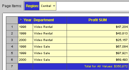
- Click OK. Discoverer sends
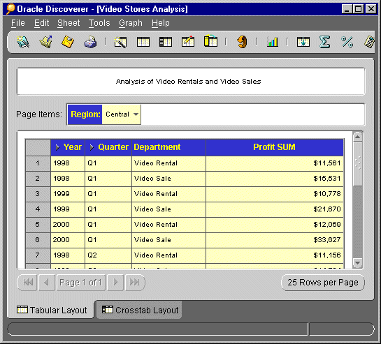
the Worksheet's query to the database. The Worksheet
now shows all the Departments on a single page. Notice also that the Region Item is displayed in the Page Items
area. To display data for a different region, click the down arrow in the 'Central' Page Item and choose another
Region from the list of options. The Worksheet will be updated with data for that Region.
Drilling in and out of detail
Now that you see data for each department group sorted by Year, you may wonder "Are
sales better in some Quarters than others?" Right now your Worksheet only shows you data for each Year. To
answer this question, you need to drill into the data
and show detailed sales information by Quarter.
Notice a small triangle next to the Item Year. This is a drill icon; it indicates that you
can drill deeper into this Item to get more detail.
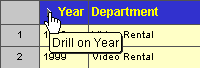
- Click the drill icon for Year.
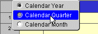
- A drop-down list appears with the choices:Calendar Year,
Calendar Quarter, and Calendar Month. Click Calendar Quarter to drill down
to Quarter level.
- When the query finishes,
your Worksheet now contains a new column, Quarter.
The profit data is also now broken down for each Quarter.
By using drill icons, you can see deeper levels of detail about your data. If this is too much detail for you,
use the drill icon again to collapse the quarterly
detail back into yearly totals.
To drill out of the Quarter data back to the original Worksheet, (or collapse the data), click the drill icon next
to Quarter and choose Calendar Year from the list of options. The Quarter Item is removed.
Adding Totals to Worksheets
In this section, we learn how to add a Total to a Worksheet.
- Connect to the Video Store Tutorial database and open the Video Stores Analysis Workbook. Hint.
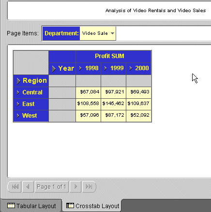
- Click the Crosstab Layout tab to display the crosstab Worksheet.
- From the menu, choose Tools | Totals.
The Edit Worksheet dialog appears, open to the Totals tab.
- Click New to create a new
total. The New Total dialog appears.
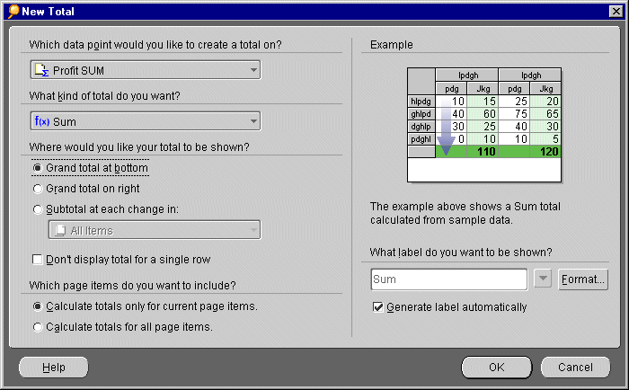
- Under the question, "Which data point would you like
to create a total on?", click the drop-down list and choose Profit SUM. You want to see a total of all the profits for each year.
- Under the question, "What kind of total do you want?", click the drop-down list and choose SUM.
Discoverer offers you different types of totals to choose from, such as Sum, Average, Maximum, and Minimum. In
this case, you want the sum of the profits.
- Under the question, "Where would you like your total
to be shown?", click Grand total at bottom.
- Click OK. Discoverer returns
you to the Edit Worksheet dialog. Notice that your
new total, called Grand Total Rows Sum for Profit SUM,
appears with a check mark next to it.
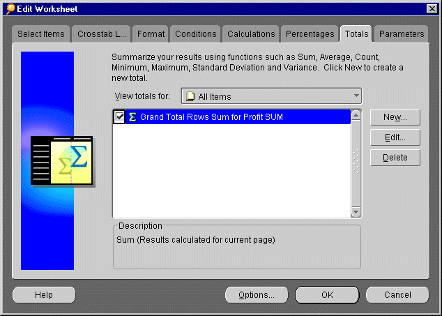
- Click OK to use this total
in your Worksheet. After the query finishes,
the Worksheet now shows a subtotal for each year.
By experimenting with the Totals dialog, you can create totals that answer your unique business
questions and show the kind of detail you want. Experiment with other types of totals, such as Average, Maximum,
and Minimum.
Adding Percentages
Now that you know the sum of profits for each year, what if you want to find out the percentage
that each department contributed to the bottom line? Which departments contribute a higher percentage than others
toward the total profit? To find the answer to these questions, Discoverer allows you to add a new column to your
Worksheet that calculates percentages for you.
- Connect to the Video Store Tutorial database and open the Video Stores Analysis Workbook. Hint.
Then, click on the Tabular Worksheet.
- From the menu, choose Tools | Percentages. The Edit Worksheet dialog appears,
open to the Percentages tab. If your Discoverer administrator
or another user has already created percentages, you see them listed on the Percentages tab. If you don't see any percentages listed, no one has created any yet. Your job is to create
a new percentage.
- Click New. The New Percentage dialog appears.
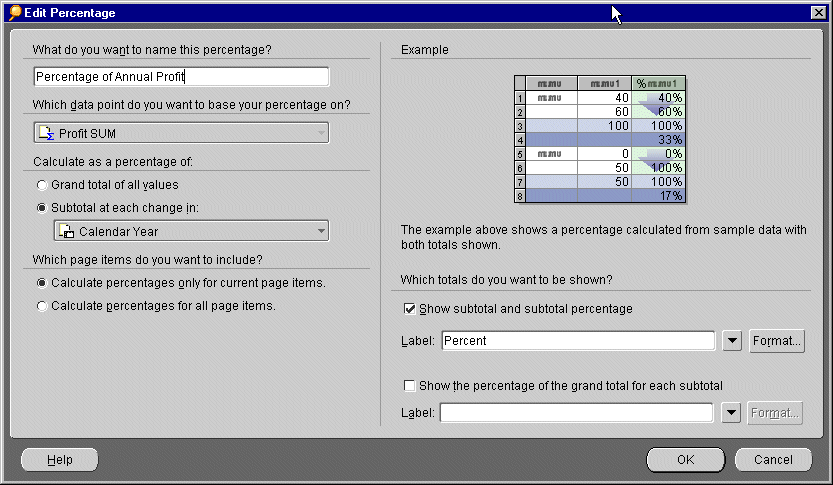
- Answer the question, "What do you want to name this
percentage?" by typing: Percentage of Annual
Profit. You want Discoverer to find the grand total of the profits for all departments,
and then calculate the percentage that each department contributed to the grand total.
- Answer the question, "Which data point do you want to base your percentage on?"
by choosing Profit Sum from the drop-down menu.
- Under Calculate as a percentage of, choose
Subtotal at each change in, then choose Calendar Year
from the pull-down list below.
- Answer the question, "Which page Items do you want to
include?" by choosing Calculate percentage only
for current page Items. Discoverer calculates a total percentage for Page Items in your Worksheet. In this case, you have
only one Page Item: Region. Discoverer calculates
the total percentage for all regions.
- On the right side of the New Percentage
dialog, put a checkmark in the Show subtotal and subtotal percentage check box.
- Click OK. You return to the
Percentages tab.
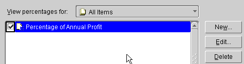
The name of your percentage, Percentage of Annual Total, appears in the Percentages tab with a checkmark next to it.
- QUESTION: What do you think the checkmark is for? What do you think happens if you remove
the checkmark? Answers.
- Click OK. The Worksheet appears
with a new column called Percentage of Annual Profit.
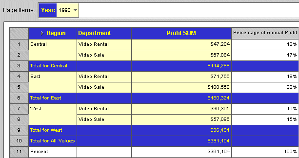
We can now see that in 1998, the Video Rental Department in the Central Region made 12%
of the annual profit across all three Regions. If we wanted to produce a report on percentages, we could now re-sort
our Worksheet on our new Item Percentage of Annual Profit.
Adding Calculations
In addition to adding totals and percentages, you can create your own custom calculations
to add to your Worksheet. Do you need to find the profit margin for each department? Do you want to calculate the
commission earned by your sales people? Do you want to calculate sales tax and show it in the Worksheet? Using
Discoverer's Calculation feature, you can create custom calculations that meet your own unique business needs.
In this portion of lesson 3, you will create a custom calculation to find the sales tax
due for each department's profit.
- Connect to the Video Store Tutorial database and open the Video Stores Analysis Workbook. Hint.
Then, click on the Tabular tab.
- From the menu choose Tools | Calculations. The Edit Worksheet dialog appears,
open to the Calculations tab.
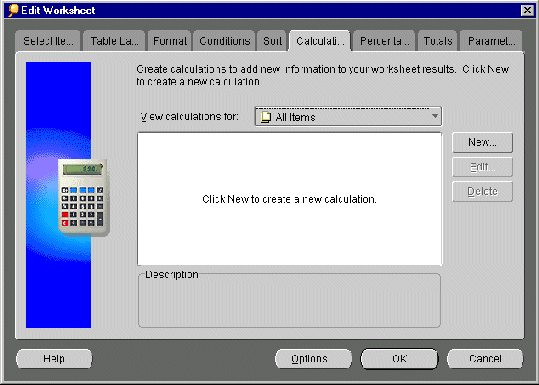
- If your Discoverer administrator or another user has already created calculations, you
see them listed on the Calculations tab. If you don't
see any calculations listed, no one has created any yet. Your job is to create a new calculation.
- Click New. The New Calculations dialog appears.
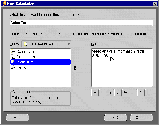
- Answer the question, "What do you want to name this
calculation?" by typing: Sales Tax. You want Discoverer to the calculate sales tax for each department's profit.
- In the Show list box, click
Profit SUM and then click Paste. Profit SUM moves
to the Calculation list box. You are now creating
your new calculation in the Calculation list box.
- To calculate a sales tax of 8 percent, you will multiply Profit times .08. Click the [x] button, the symbol for multiplication. And then type .08.
- You have just created a formula for calculating sales tax. Click
OK. Discoverer returns you to the Calculations tab.
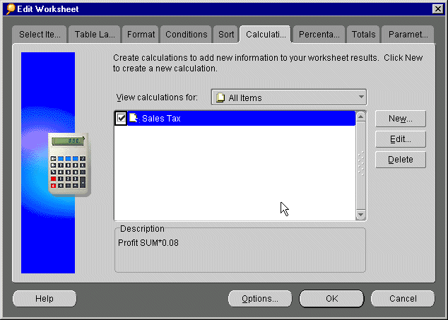
- Your new calculation, Sales Tax, appears with a check mark next to it. The check mark indicates
that this calculation is being used in this Worksheet. If you un-check the box, the calculation will not be used.
Click OK. After the query finishes, a new column appears on your Worksheet, called Sales Tax.
It shows the sales tax that each department owes for each share of profit.
Graphing Your Data
To help you analyze your data more easily, Discoverer lets you display the information visually
using a wide range of graphs and charts.
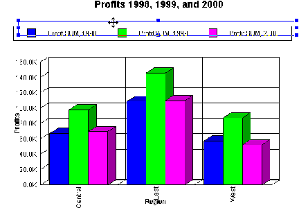
In this portion of lesson 3, you will create a Bar graph to compare Profit figures for Video
Sales and Video Rentals in 1998, 1999, and 2000.
- Connect to the Video Store Tutorial database and open the Video Stores Analysis Workbook. Hint.
- Click the Crosstab Layout tab to display your data in cross-tabular format.
- Choose Graph | New Graph to
start the Graph Wizard.
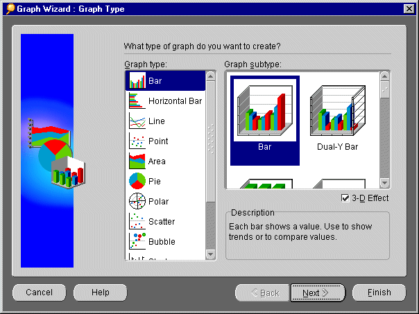
- Click the Bar option from
the Graph type list.
- Click the Bar option from
the Graph subtype list. Make sure that the 3D Effect option is checked.
- Click Next to display the Graph Wizard: Titles, Totals, and
Series page of the Graph Wizard.
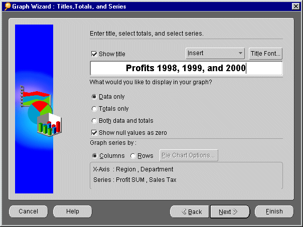
- Type "Profits 1998, 1999, and 2000" into the text box. Make sure that the Show Title option is checked.
- Click Next to display the Graph Wizard: X-Axis page of the Graph Wizard.
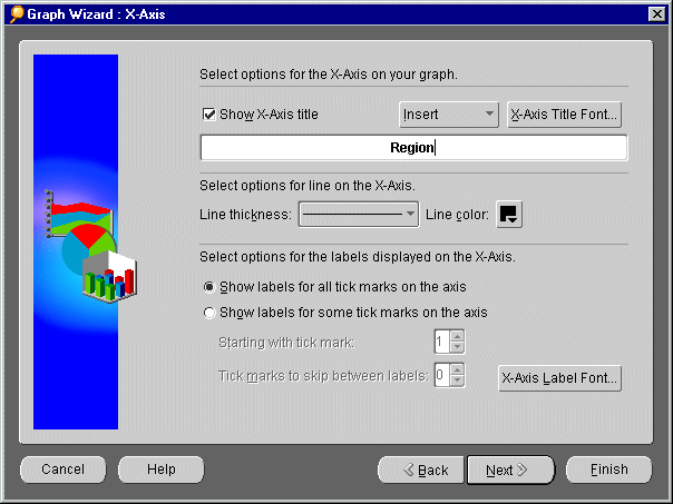
- Type "Region" into the text box as a title for the horizontal axis. Make sure
that the Show X-Axis Title option is checked.
- Click Next to display the Graph Wizard: Y-Axis page of the Graph Wizard.
- Type "Profits" into the text box as a title for the vertical axis. Make sure
that the Show Y-Axis Title option is checked.
- Click Next to display the Graph Wizard: Plot Area page of the Graph Wizard.
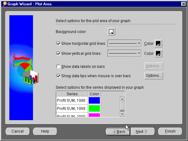
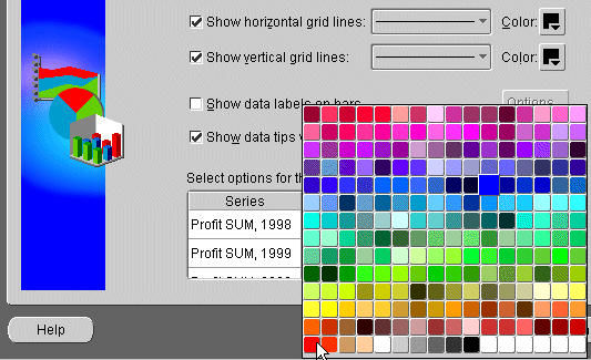
- Data columns are assigned default colors. Here, we will change the default color for the
1998 profit data. Click the color block next to Profit SUM, 1998 and choose a red shade from the color picker pane. The column Profit
SUM, 1998 is now represented in red.
- Click Next to display the Graph Wizard: Legend page of the Graph Wizard.
- Click the Location pull-down
list and choose Top to display the legend at the top
of the graph. The Sample pane is updated to show you how the graph will look.
- Click Finish.
Depending on the default position setting, your graph is displayed either as part of the
Worksheet or in a separate window. If your graph is not visible on your Worksheet, choose Graph
| Display Graph and choose Right of Data option.
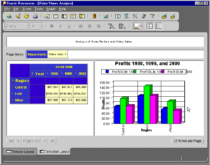
- Now that you have created your graph, you can edit it on screen by clicking elements and
dragging them to another location. Or, you can right-click elements to display editing menus. Click to the right
or left of the legend to display its blue editing box, click a corner point, and then drag it to re-size the legend.
Or, to re-position the legend, drag the whole editing box to a new position.
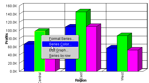
- You can also right click graph elements to access editing options, for example to display
the Graph Wizard. Right-click over one of the columns to display the editing menu, then choose Series Color to display the color picker panel.
Having created your graph, you can now print it or export it as part of your Worksheet.
See also Sharing your results with others.
Summary of Lesson 3
As you can imagine, the possibilities of using Discoverer's data analysis tools are limitless.
For almost every business question, there is a way to analyze data and arrive at an answer. By using combinations
of sorting, pivoting, and drilling you can arrange the data on your Worksheet in a way that lends itself to easier
analysis. By adding totals, percentages, and custom calculations, you can extend the information you already have.
By adding graphs and charts you can analyze your data visually - this allows you to compare numerical data and
see trends at a glance. The more you use Discoverer, the more opportunity you will find for combining its analysis
tools in ways that suit your unique business needs.
Return to Tutorial Home Page
Answers and Definitions
What do you think the checkmark is for? What do you think happens
if you remove the checkmark?
A check mark next to a total, percentage, or calculation indicates that it is active in
the Worksheet; that is, that the Worksheet is currently using that total, percentage or calculation. If you remove
the checkmark, you effectively turn the total, percentage, or calculation off. To turn it back on again, put the check mark back.
Query. Every time you open a
Workbook or create a new one, Discoverer sends a query to your company's database. A query is a question that Discoverer asks the database in order to get the data you want. Queries are written
in SQL, a language that databases understand. You do not need to understand SQL to communicate with the database.
Discoverer writes the SQL for you.
Data Point. Data points are
numerical data, such as Sales, Cost, or Profits. There are two kinds of data points: detail data points and aggregate
data points. A detail data point is one sale or the cost of one product. An aggregate data point is a summary,
such as total profit over a year or quarter.
Items. An Item is a name for a specific set of data in the database; for example, if you want to see all departments
in the database, you select the Department Item. In a Worksheet, Items appear as column and row headings.
Page Items. A Page Item is a special Item that groups all the data on a page; for
example, data can be grouped into separate pages by the years 1998, 1999, and 2000. On a Worksheet, a Page Item
appears above all the other column headings. This special Item means that all the data currently visible in the
Worksheet describes a single year (for example 2000). By selecting different Page Items from the Page Item drop-down
list, you are actually switching pages within that Worksheet.
Axis Items. Like Page Items,
axis Items are special Items on a Worksheet. Axis
Items can be moved to another location on a Worksheet. For example, you could move the Item, Department, to the
side axis, thus making it a row heading. You could move it to the top axis, making it a column heading. Or you
could move the axis Item to the Page Items axis, making Department a Page Item.
Copyright © 2000, Oracle Corporation. All rights reserved.